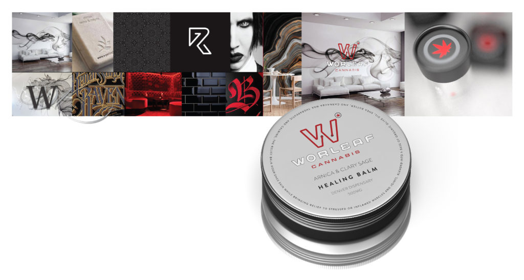
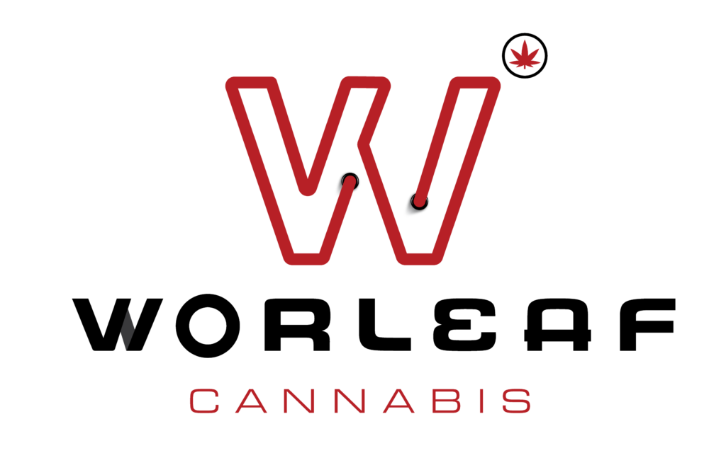
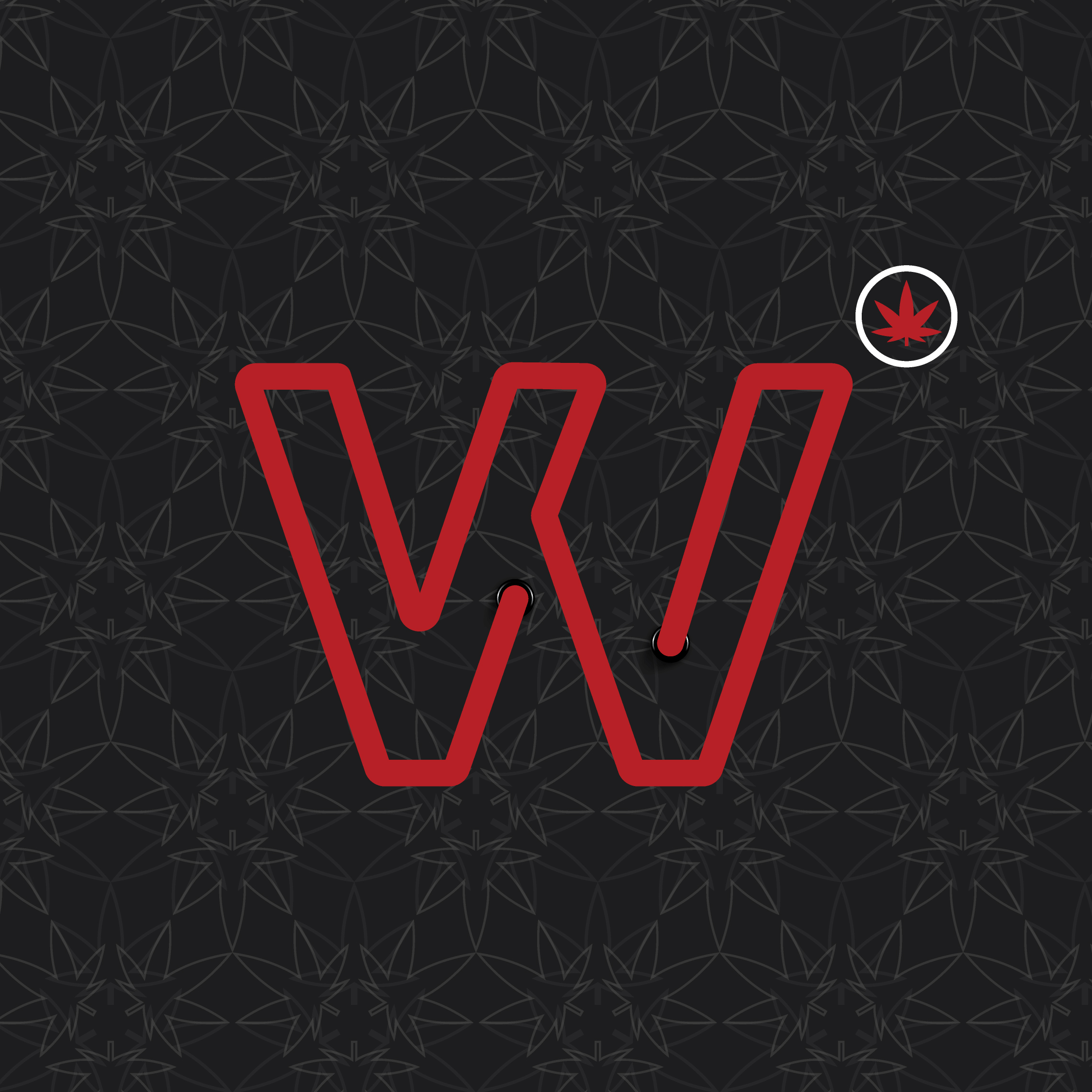
Kerning were charged with renaming the brand and through a naming exploration and exercise discover the concept of Whorl Leaf. This is the stepped geometric pattern the cannabis plant follows during the growing cycle. This brand mark was further inspired by local street art and the maligned "back-street" association of the product. Neon infused and subversive elements embrace the heritage of the product to define the master logo.
New Brandmark
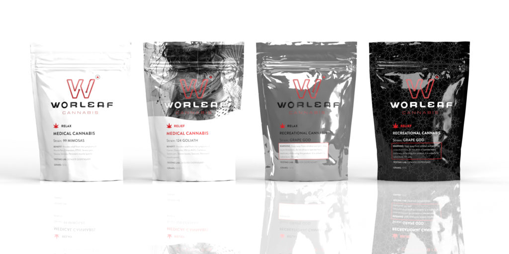
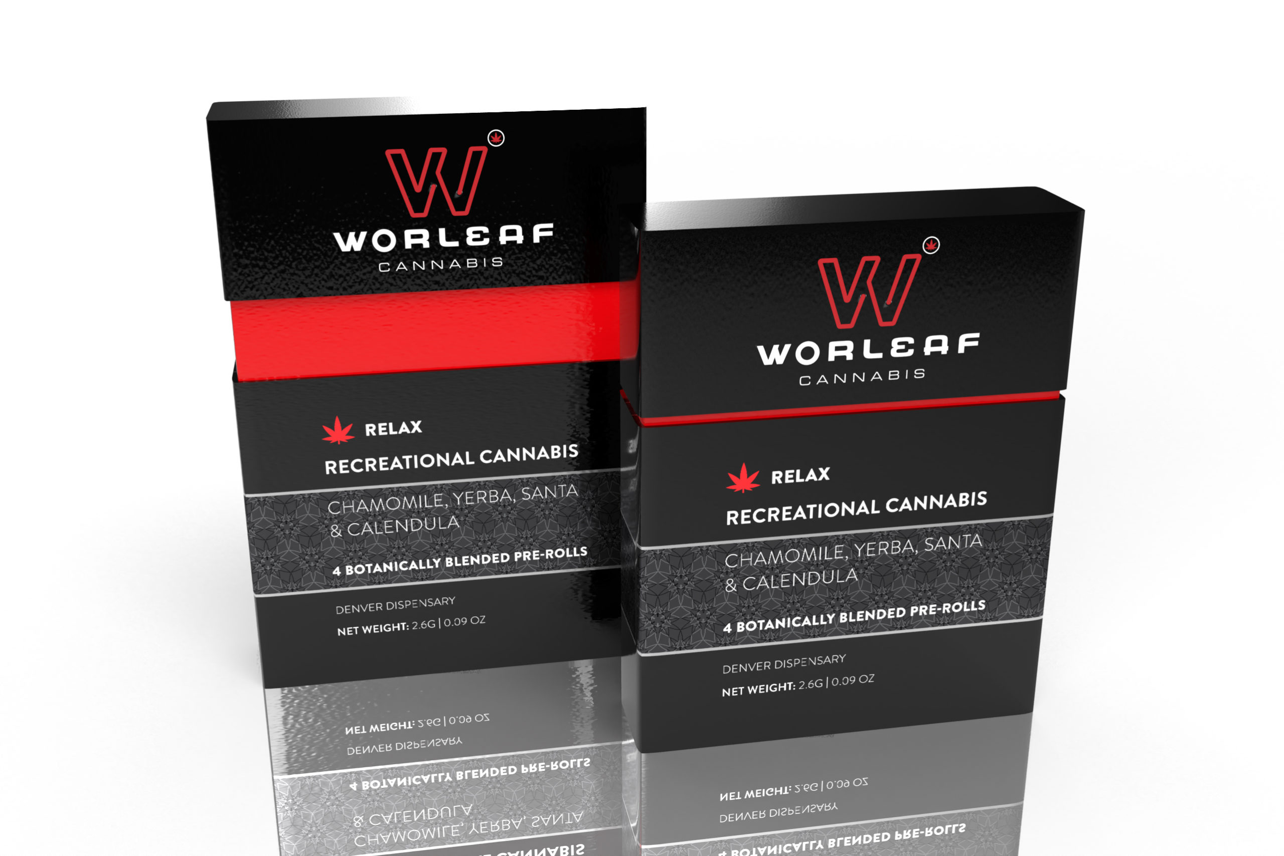
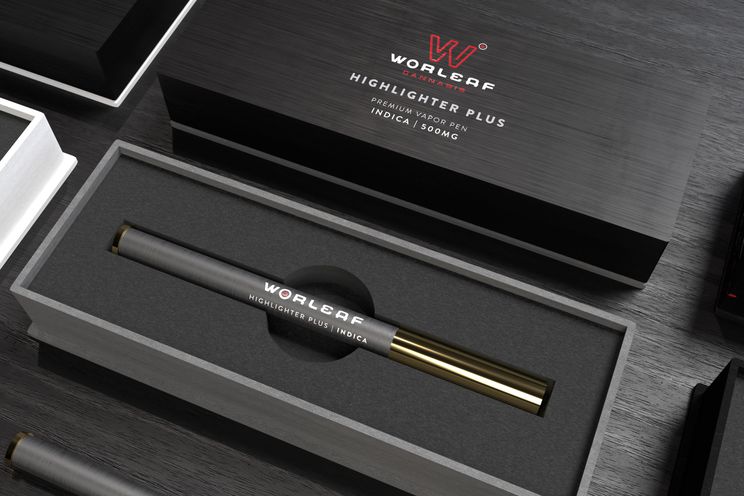
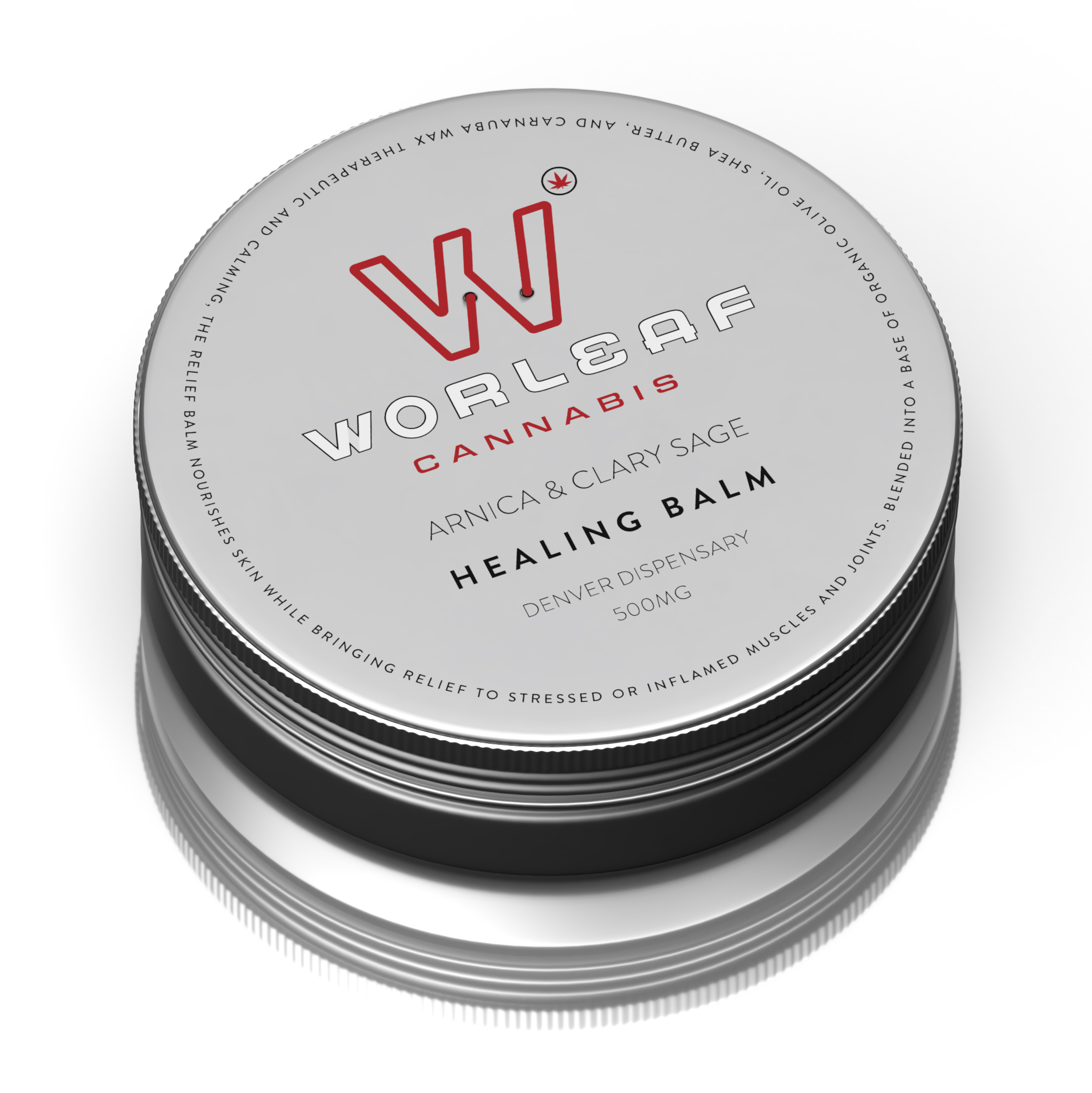
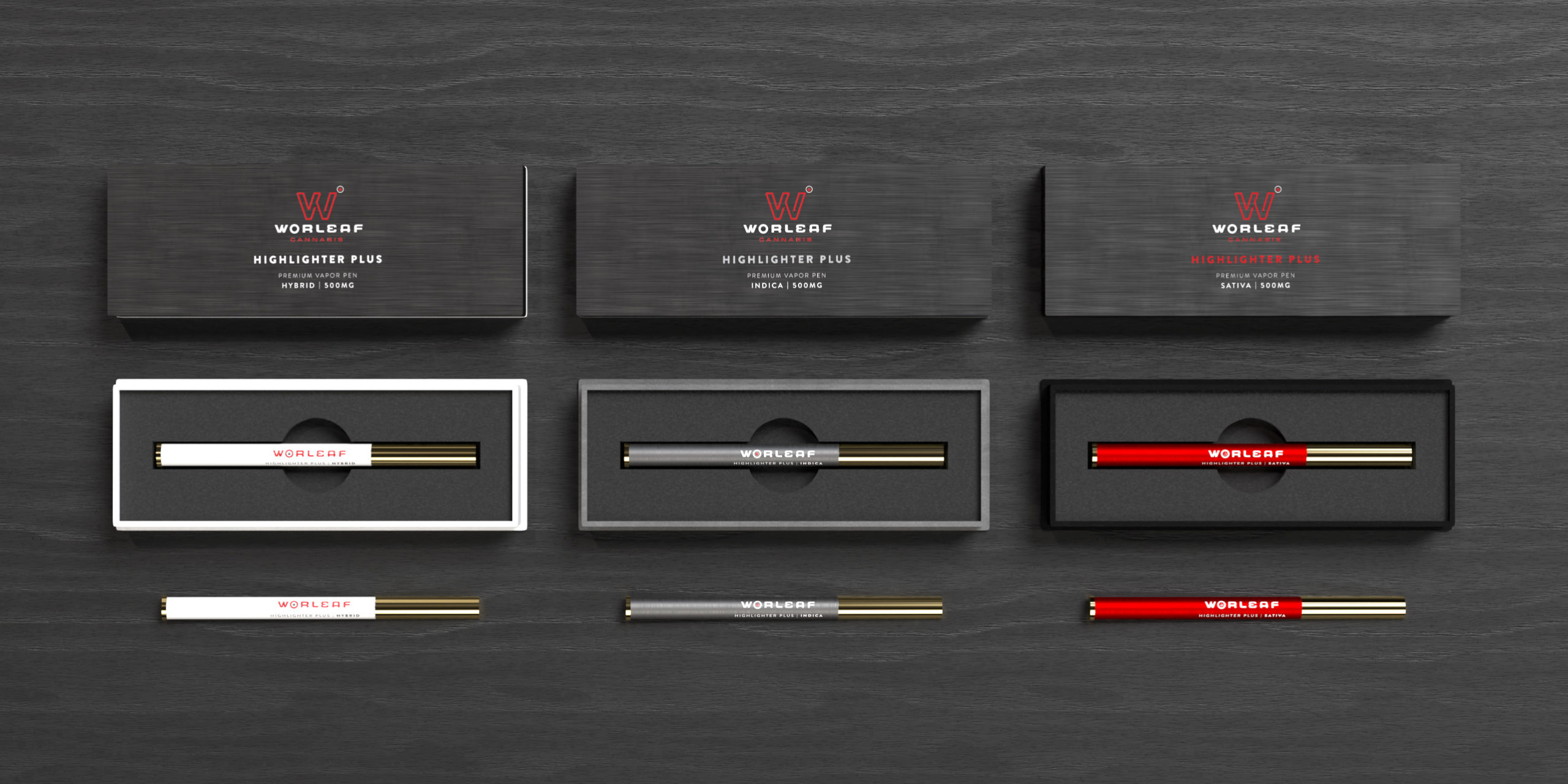
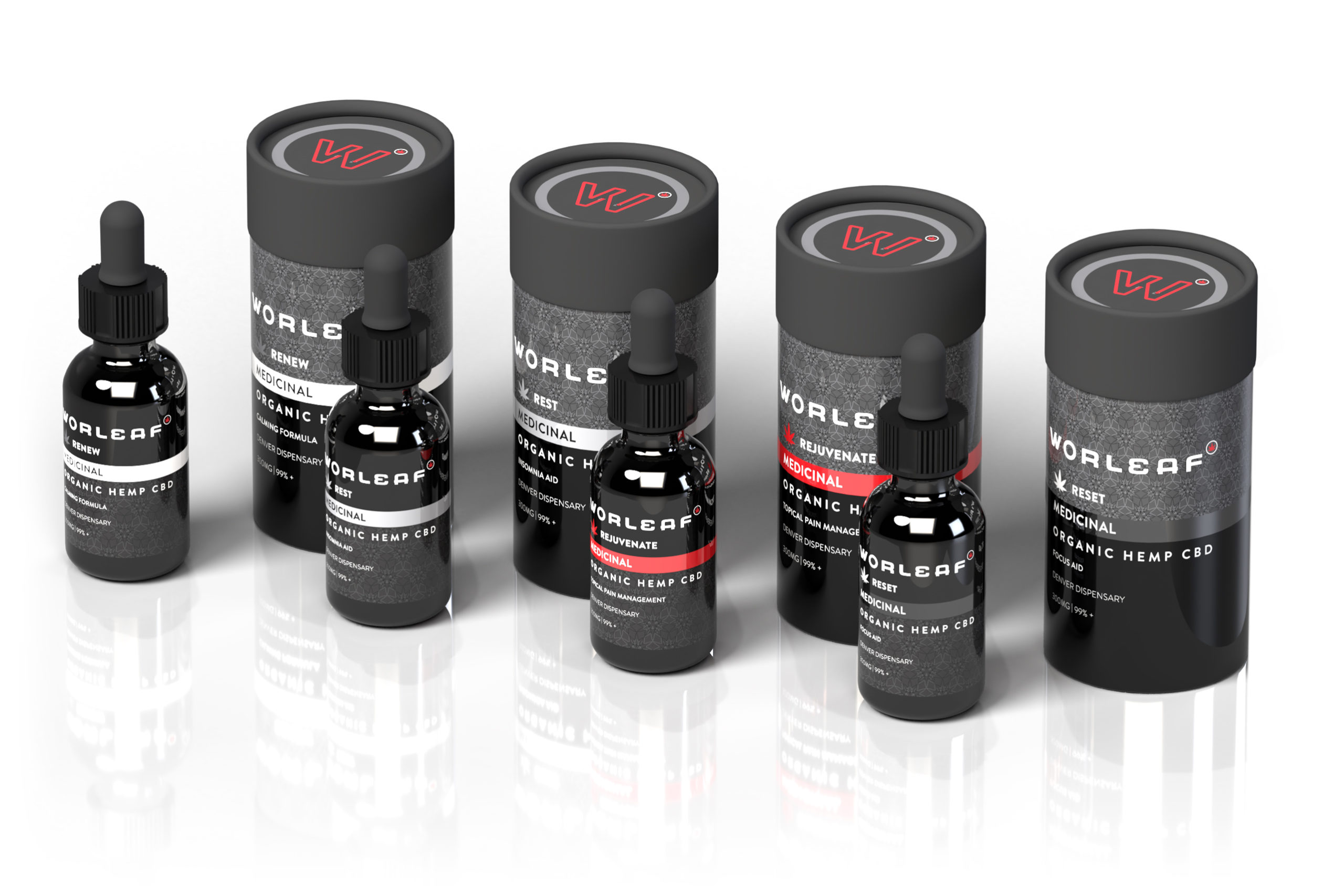
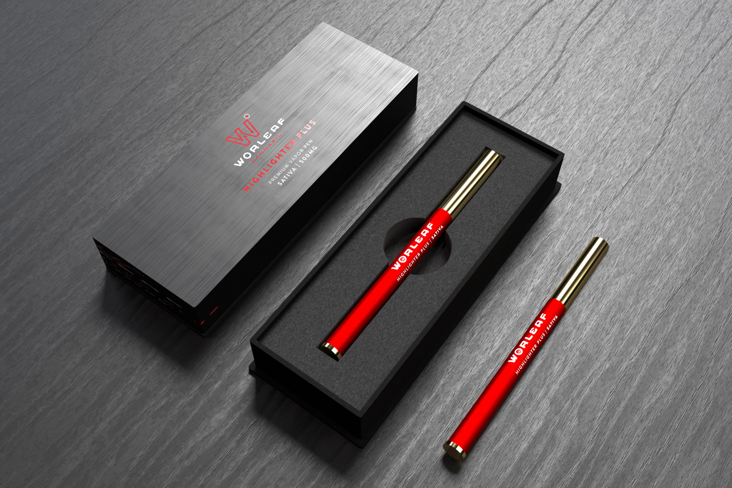
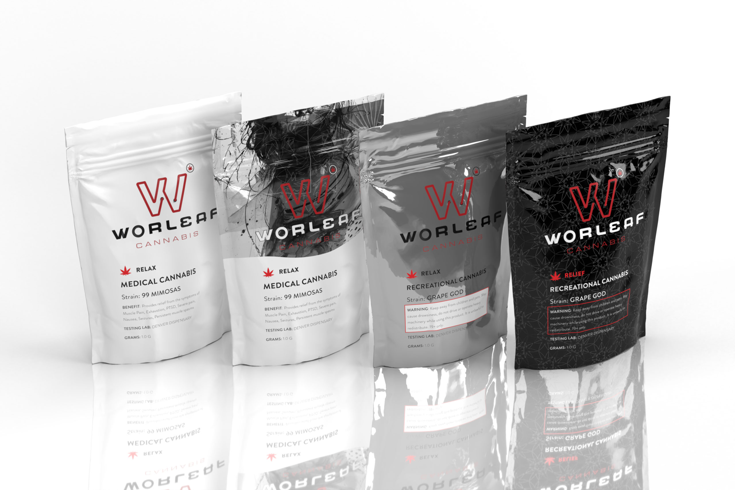
The following is a range of design elements, branding alternates and category-specific, packaging design samples