The founders of Fretboard had been band-mates for many years and wanted to combine two passions... a love of live music, great friends and great beer.
Kerning was engaged at the start of the journey to create both fan endearing visual identity and a to develop the overall ethos of the brand, from packaging to positioning to consumer-lead innovation and product development.
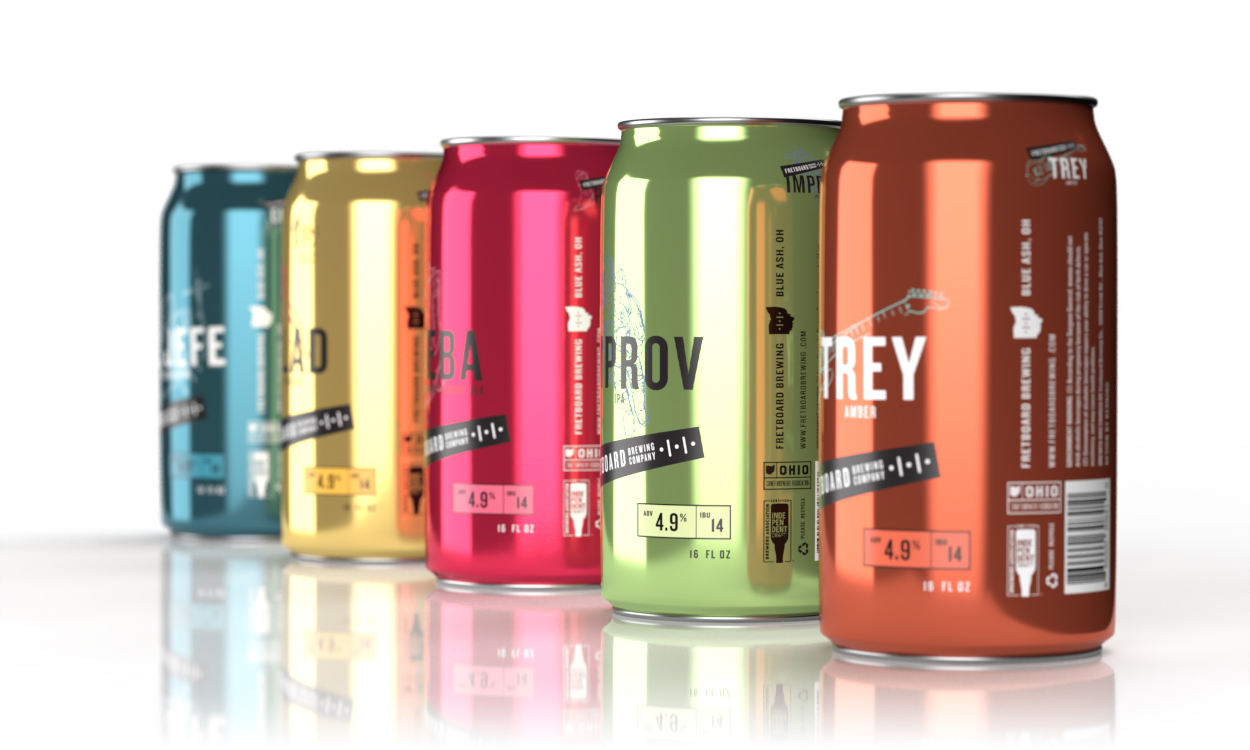
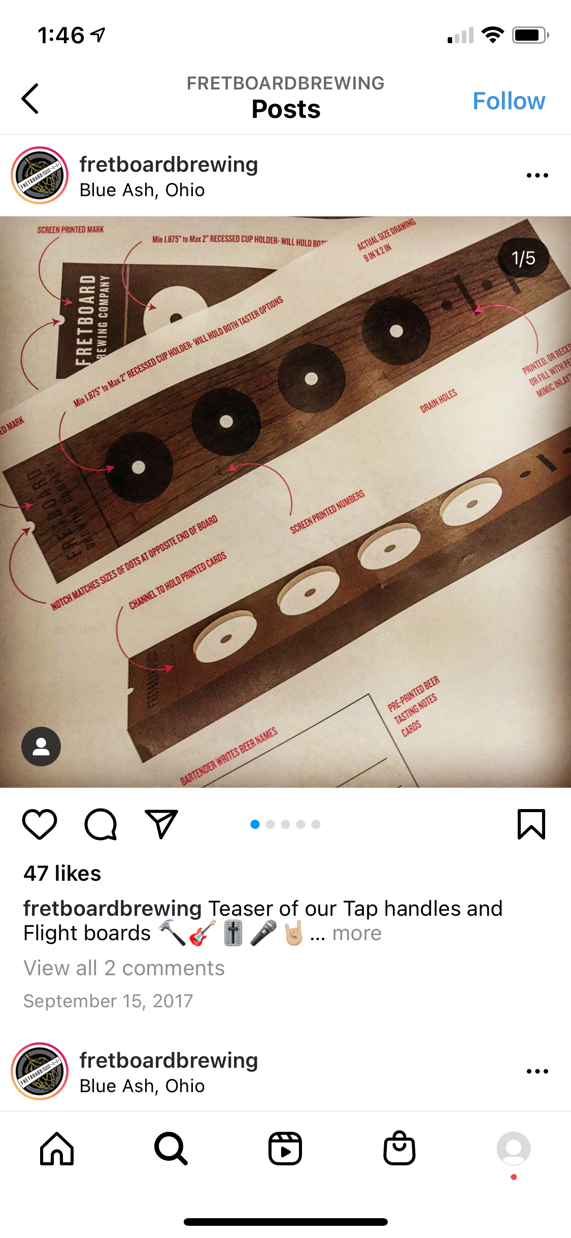
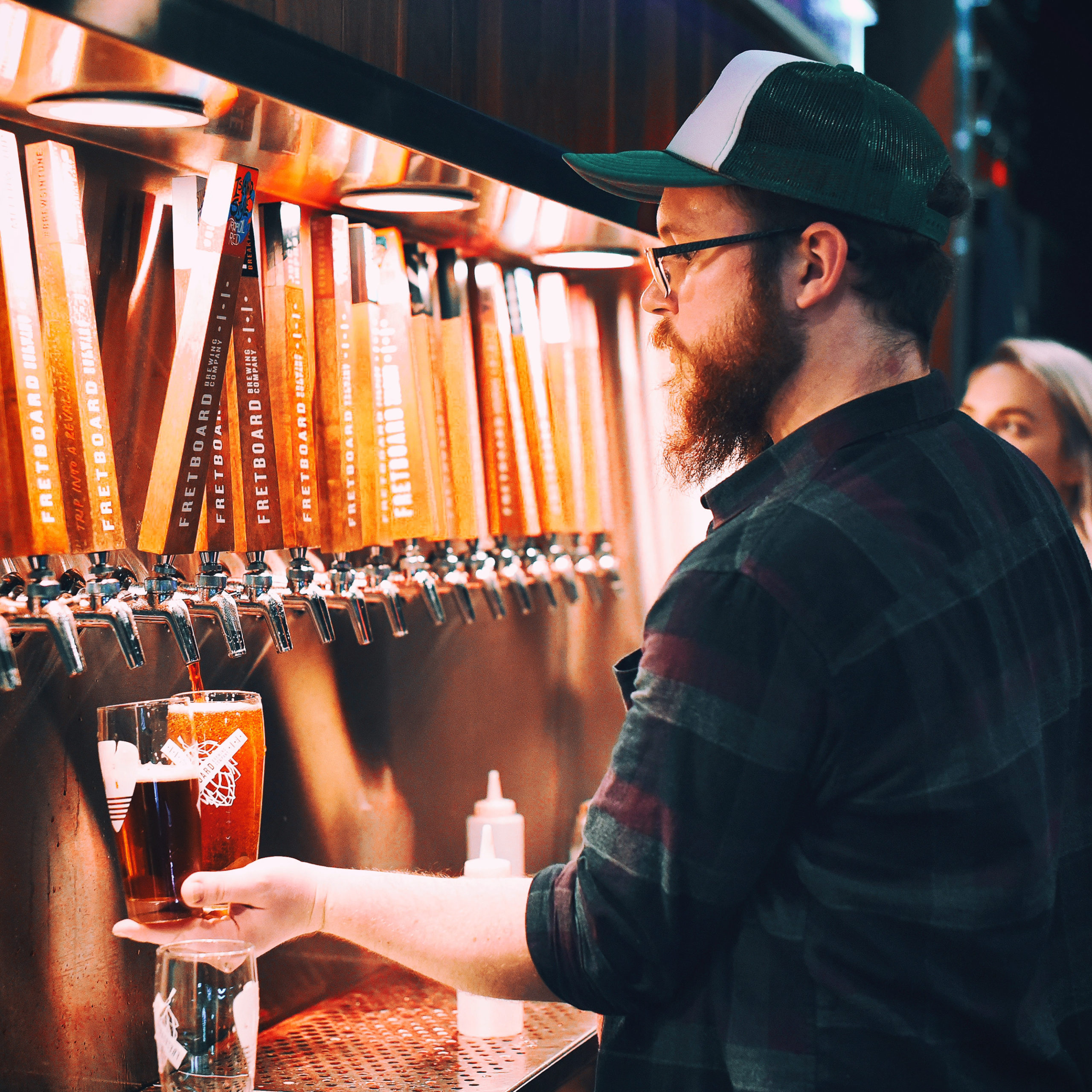
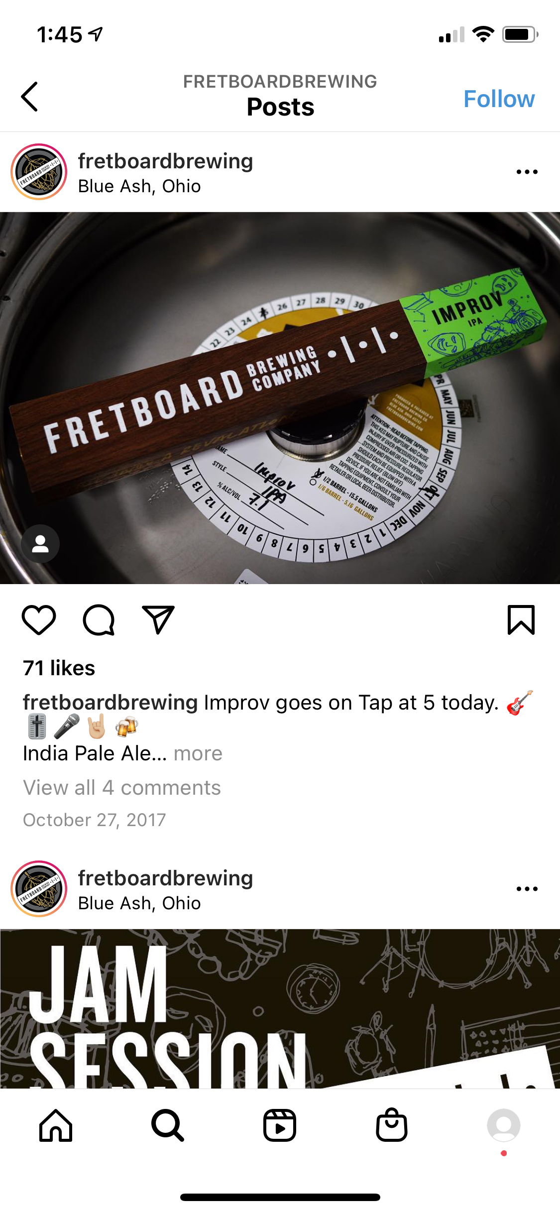
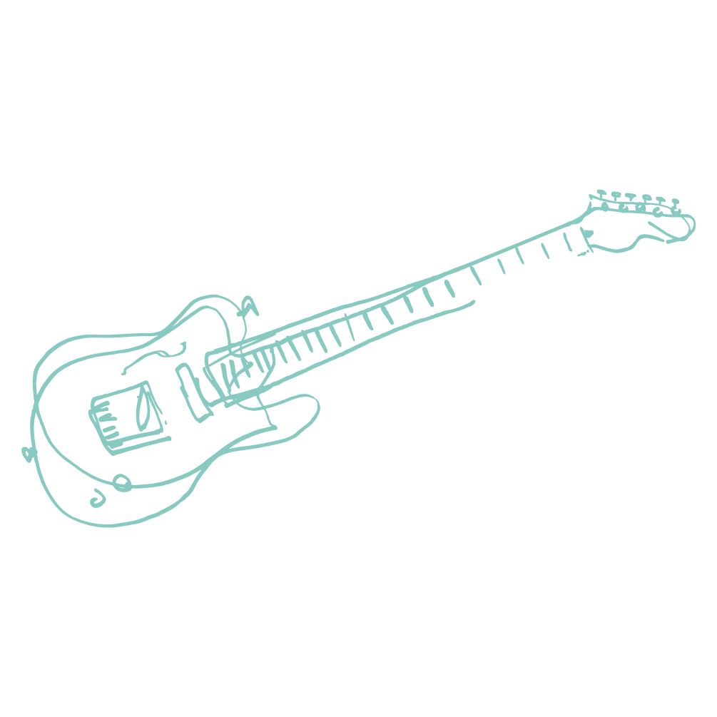
The logo was then extended to the beer taps, using the "Guitar" neck as inspiration for the color-coded and beer-specific tap levers. Further use of musical motifs such as guitar picks were additionally employed as branding elements
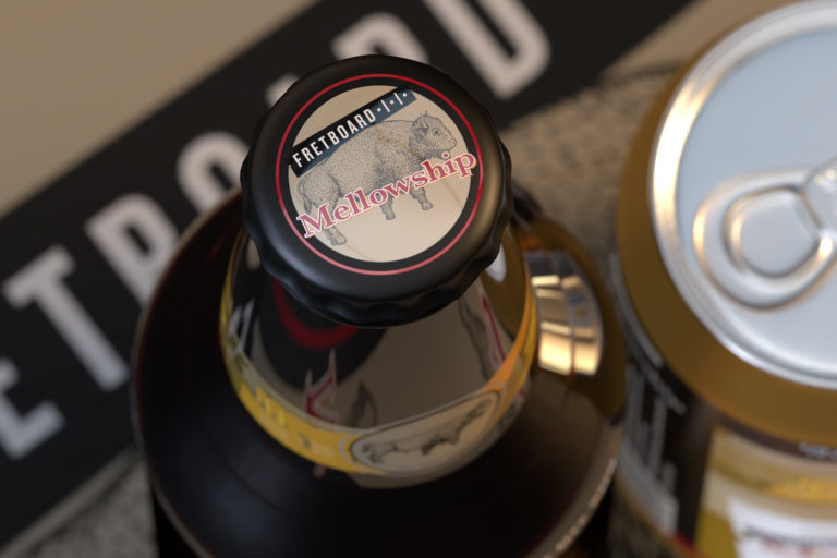
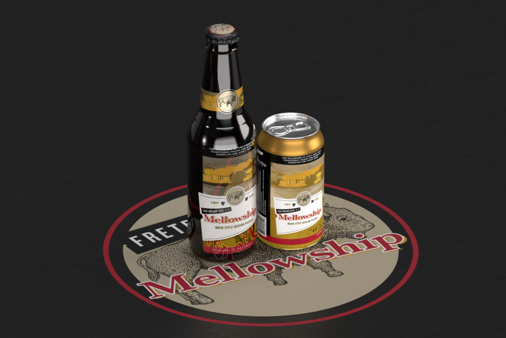
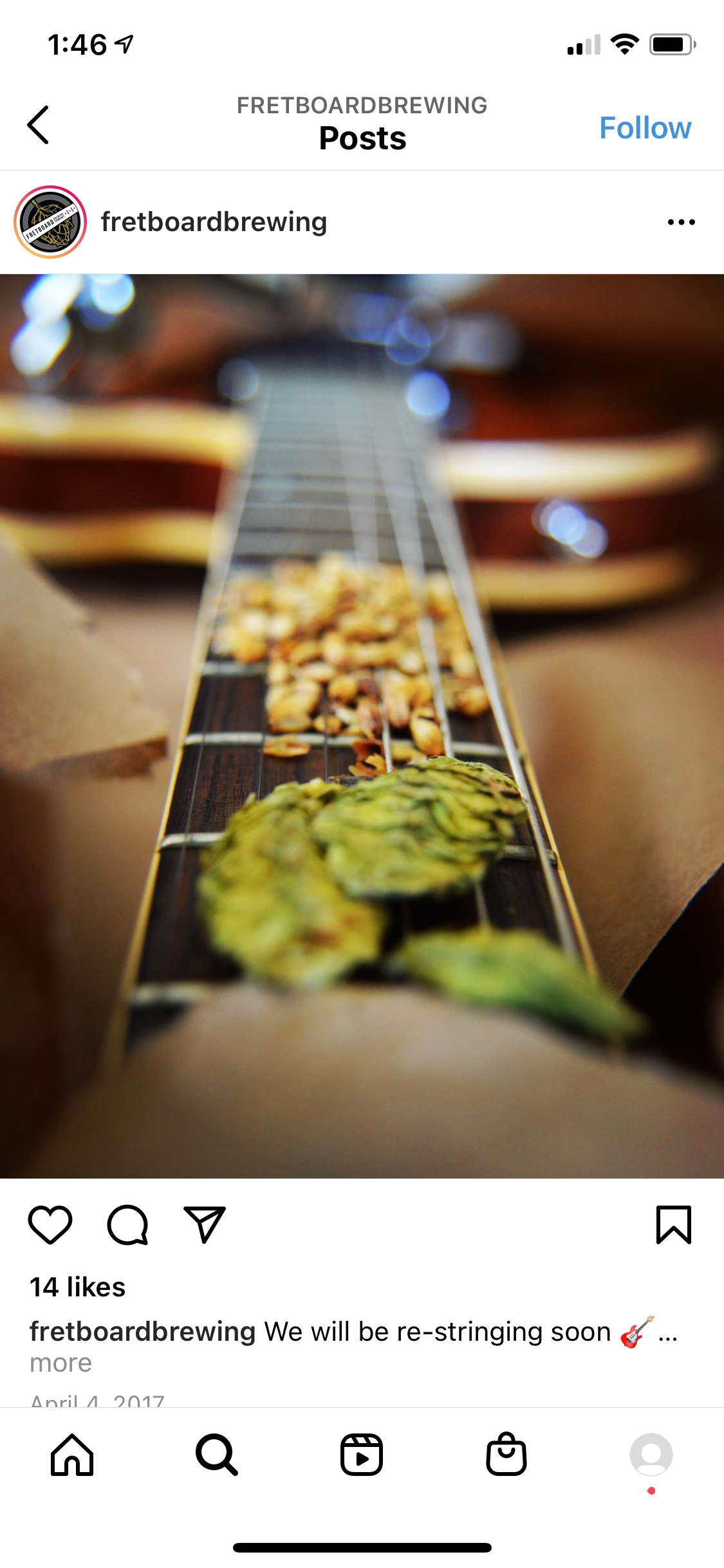
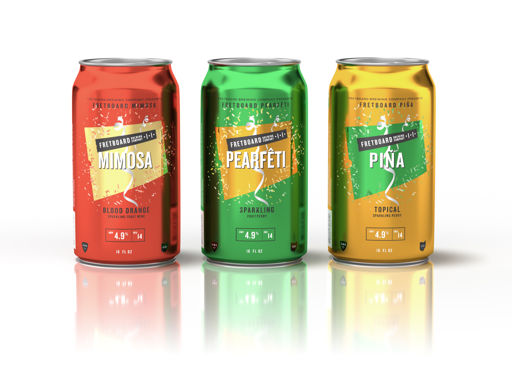
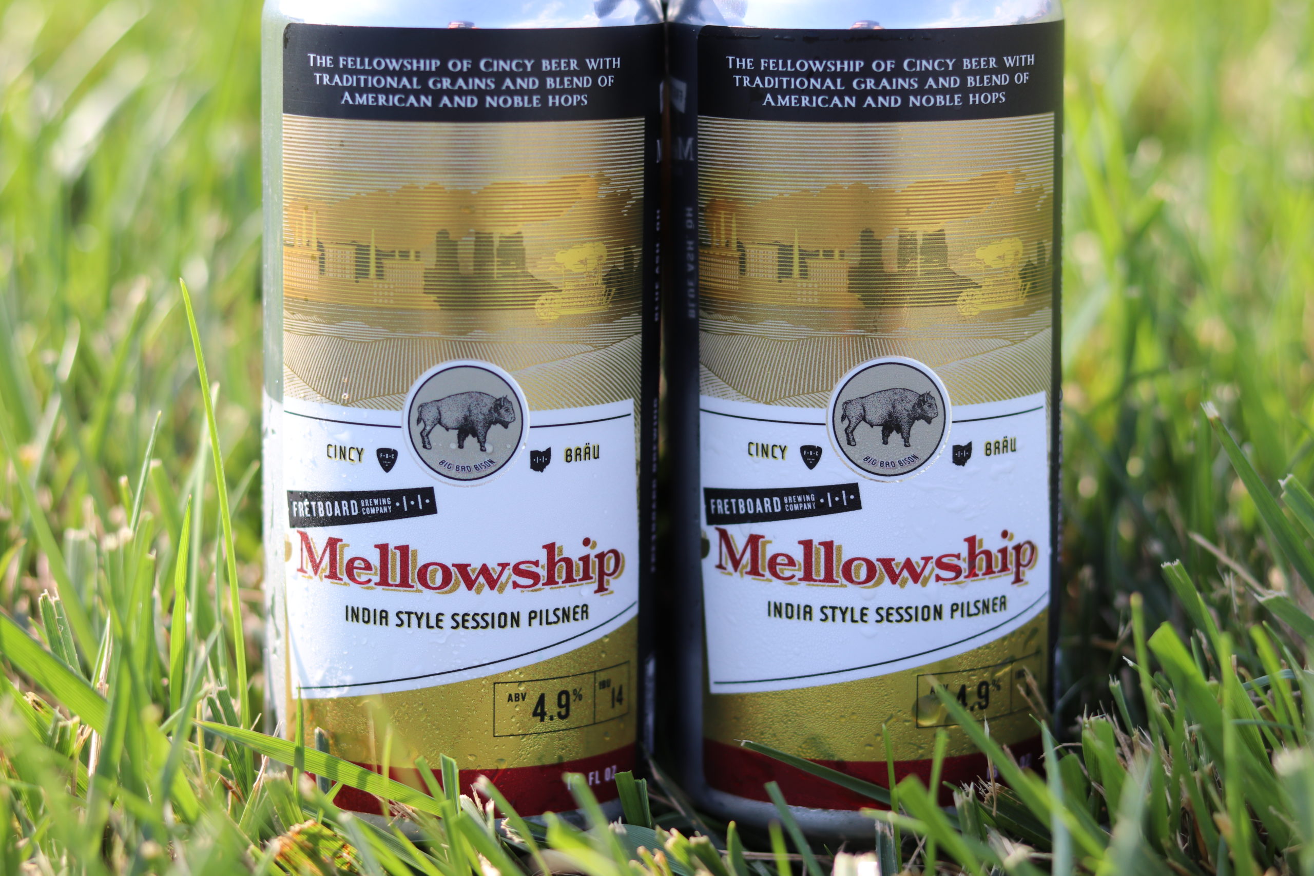
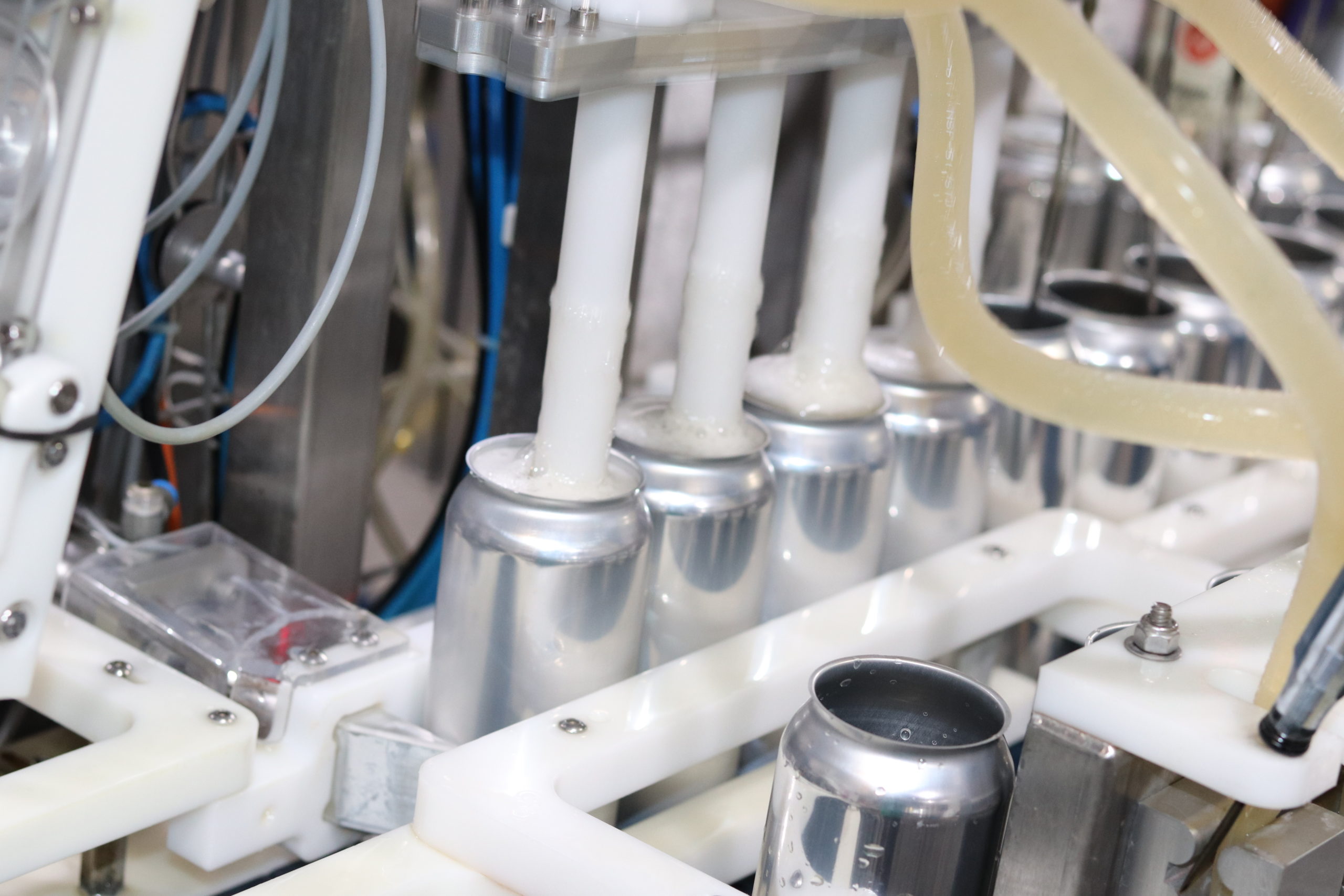
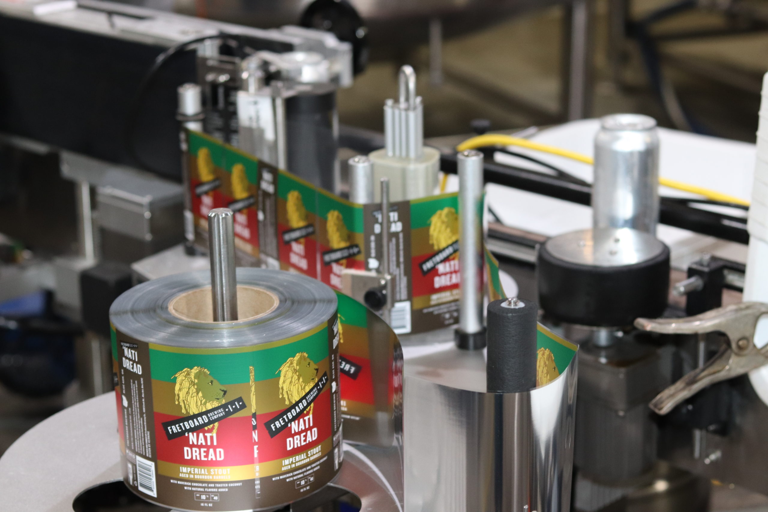
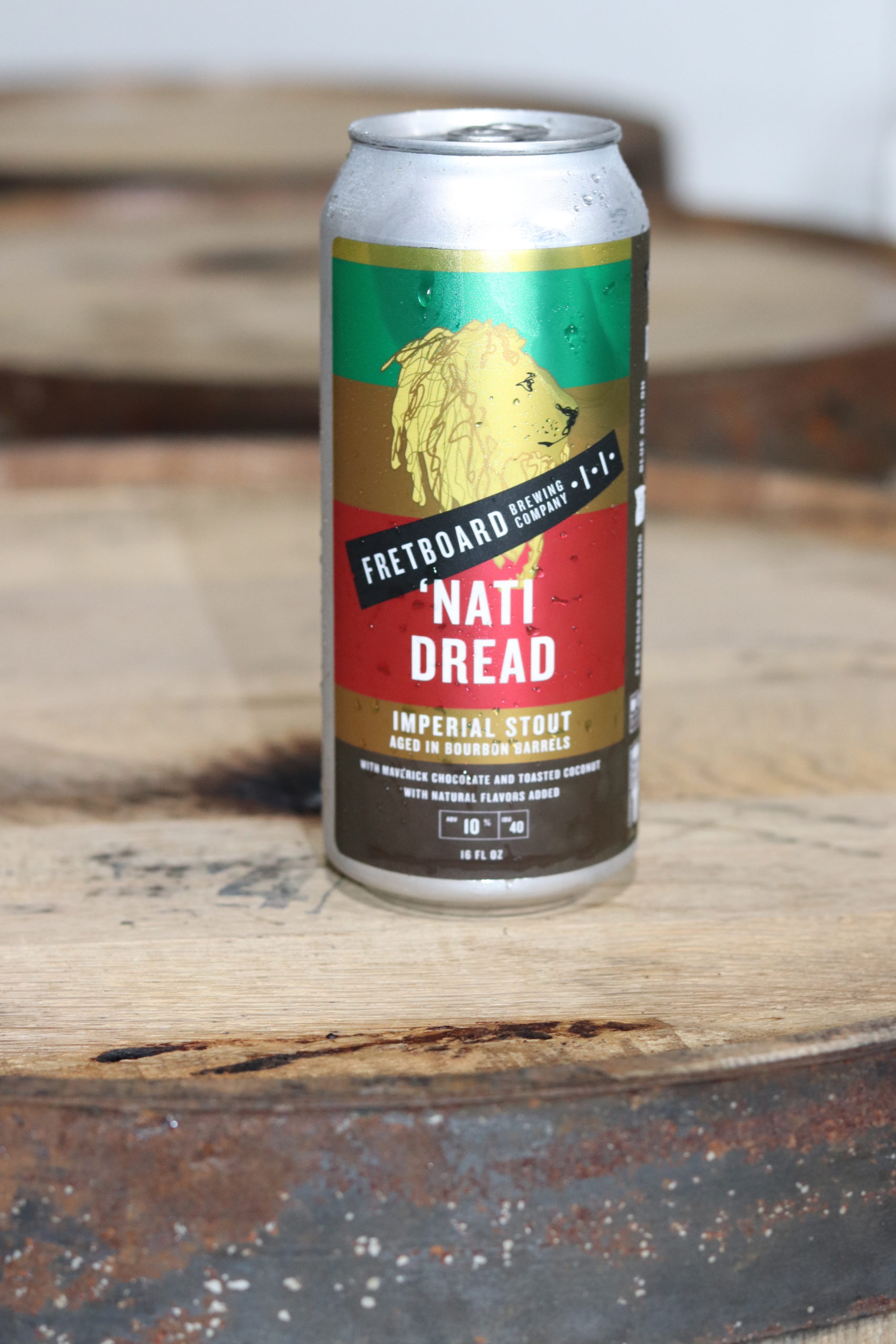
The following imagery is a range of product shots, core and promotional products, interiors and social media posts
